Nam June Paik – The art of a connected world

Our life is half natural and half technological. Half-and-half is good. You cannot deny that high-tech is progress. We need it for jobs. Yet if you make only high-tech, you make war. So we must have a strong human element to keep modesty and natural life. 

– Nam June Paik
IMG_3467

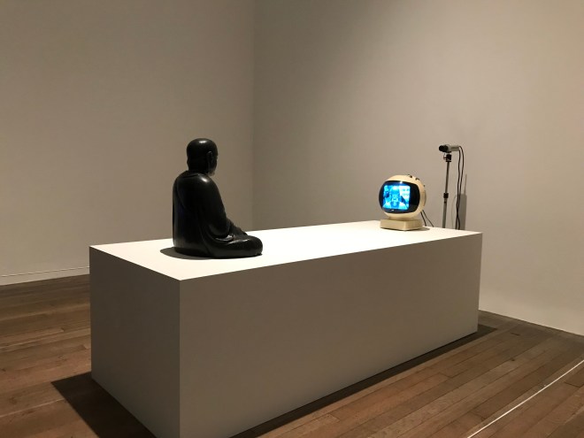
As I entered the first room of this exhibition I immediately felt that this exhibition had a very different atmosphere compared to others I have been to. The electrical buzzing sound, the flashing colours and the Buddha statue sitting in front of a TV watching himself all made it very clear right at the start that Nam June Paik (1931-2006) was not an artist who followed the mainstream.

The South Korean artist, who lived and worked in Japan, Germany and the United States mainly focused on cultural differences, traditions of both Eastern and Western cultures, especially through the lens of our increasingly connected world. The exhibition at Tate Modern showcases the artist’s work through five decades.

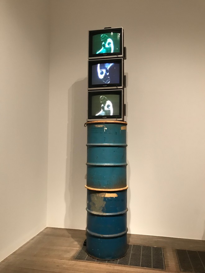
One of my favourite work regarding the use of sound and vision was the ‘Oil Drums’. Paik made this work as a memorial to Charlotte Moorman following her death in 1991. The ‘topless cellist’ worked together with Paik for almost thirty years. They shared a common interest in avant-garde music and staging energetic live performances and believed that sexuality was unjustly excluded from classical music.

The exhibition piece is two metal barrels that were used during Moorman’s performances of Variations on a Theme by Saint-Saens. Moorman suddenly stopped in the middle of the performance, climbed a ladder and submerged herself in the drum on top, which was filled with water. After the dip, she climbed back out and finished playing the sentimental tune while dripping wet.

Placing the three TVs on top of the two barrels makes the observer feel like they are watching the whole performance in real-time. The echoes of the drum and the water blurred the border of reality in my head as I watched the screen. Looking at the screen from below also made me feel like I was right there while Moorman performed. With this piece Paik was playing with the idea of borders, the literal border of the surface of the water, inside and outside and also on an abstract level, the idea of past and present, existence and non-existence, life and the afterlife.

Turning the television in the middle upside down was also interesting. As Moorman submerged herself in the water she was getting closer to herself on the screen on top, but simultaneously moving away from herself in the bottom screen.
IMG_3570
Oil Drums, Hommage a Charlotte Moorman 1964,1991 (Click to view)

Num June Paik’s significant role in finding the bridge between art and technology is unquestionable. He was exploring the border between the two and experimenting with the TV and the screen. He used the screen as a canvas like nobody before him. The Korean American artist’s work is at Tate Modern, London, until 9 February 2020.

Stop motion – Final work

This ten-second stop motion video was created for Glossier as a promotional piece.

I chose to work with their very popular birthday cake flavoured lip balm called ‘birthday balm dotcom’. During this project, I played with the idea of celebration while keeping the Glossier’s original personality and visual identity in mind.

IMG_3206
Click to view

music: http://www.bensound.com 


Stop motion – Development

One project of the Brand Expression unit was to create a promotional piece for Glossier which had to be less than 10 seconds long. Below these are the video recordings of the development of my final stop motion work.

Phase 1

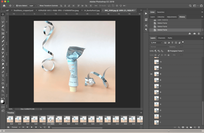
Resizing of the photographs, selecting and creating the order of the images.

Video1
Click to view

Phase 2

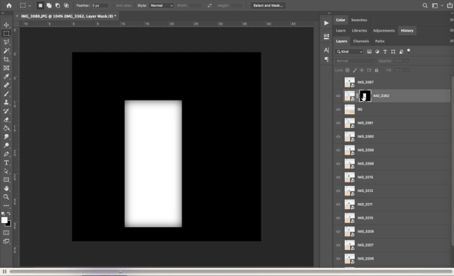
At this point I realised that the background is slightly moving so I had to create a mask to make the background consistent throughout the whole video. I also added the hand shots and exported the file.

Video2
Click to view

Phase 3

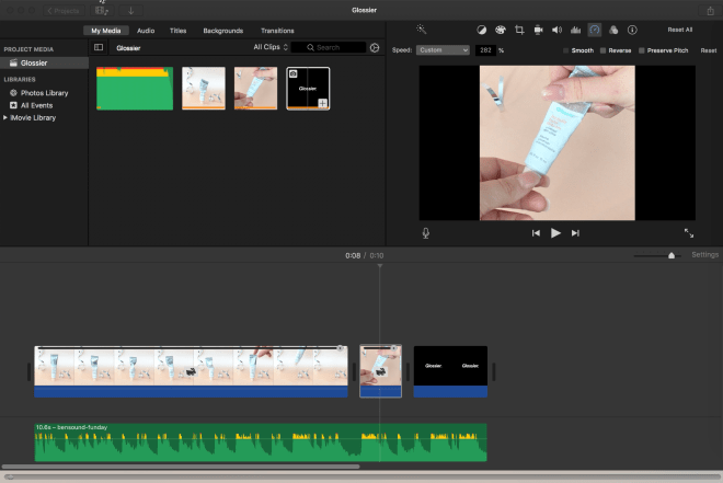
I started to edit the video and made adjustments according to the music. I wanted to divide the video into 4 parts. Dancing, Freeze, Pickup, Twist – which turns the light off.

Video3
Click to view

Phase 4

After I received feedback I brightened the colour of my images, removed the parts where the hand was present, made the dancing part a bit longer and adjusted the music to the visual.

Video4
Click to view

Looking at sound 

This lecture focused on sound, I worked together with Deepali Champaneri and were asked to record different things around the university.

It was great to focus on just one sense and look at our surroundings from a different perspective. At the end of the session, we were really just looking around with open ears and focused on what sound different materials make. To listen to some of my favourite recordings just click on the icons:

sound_image1sound_image1sound_image1

We finished the session by creating a mini video where we used a sound we just collected in the last hour. We ended up using a snoring sound that we recorded by moving the microphone on the texture of the sofa up and down then we chose a clip from the Simpsons and placed the sound over the video.

snoring
Click to view


Moving image workshop

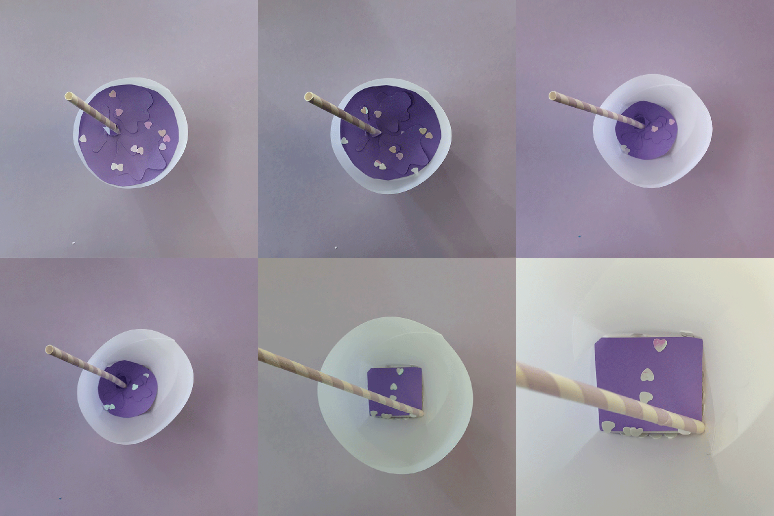
In this session, we were joined by a visiting lecturer Rachel Davey, who ran a stop-motion animations workshop. Our session had three different parts. First, we had a look at Rachel’s work and some examples of stop motion videos and technical tips. Then we were asked to come up with a concept for our own animation which needed to explore the idea of a circle turning into a square. With the materials given and our class already set up as a studio. I wanted to photograph an ice cream cone which when melts turns into a square shape. I ended up making a square-based circular ice cream glass with a straw. So when the liquid disappears from it the square shape appears. 

I learned a lot in this session as I never made a gif animation before. My final work did not work out how I imagined but it definitely made me realise that lighting is really important and also that for my final sound and vision project I have to do test shoots before I settle on an idea.

IceCream.gif


Sound and Vision briefing

In this session, we were asked to work in groups and find existing examples of moving image works that we really like. 

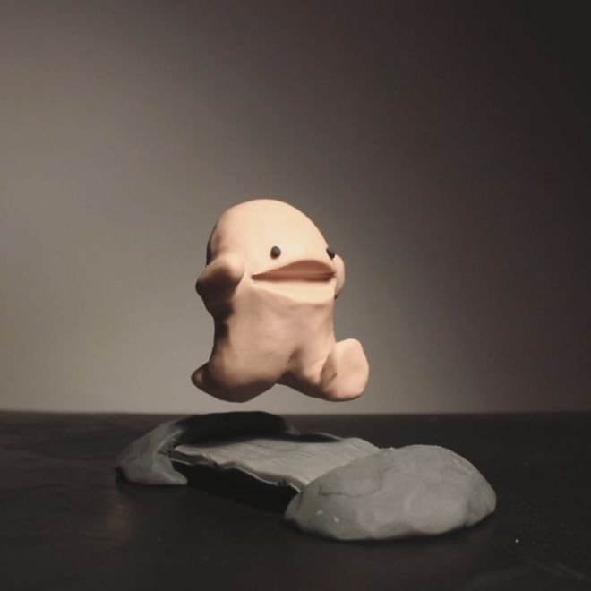
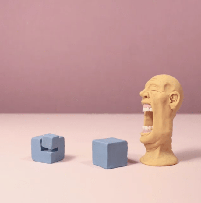
I found Alexander Unger on Instagram and really like his ideas. For most of his clay stop motion animation, he uses the same setting. I love the style of these videos. They are really well edited, funny and very engaging to watch.

54463792_625385034576194_6929065454695949210_n
Stop motion by Alexander Unger


Screen Shot 2019-11-25 at 12.18.34
Stop motion by Alexander Unger

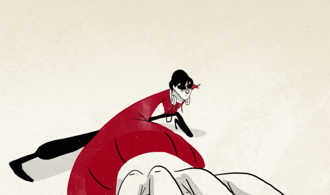
My second choice is a video by Giand Ant, a storytelling studio in Vancouver. My favorite part of this video is the first 6 seconds. I think they used the camera angle brilliantly to draw you into the story right from the beginning. Also I really like the colours, fluidity and the sound choice. Everything just feels very well balanced in this video.

Screen Shot 2019-11-25 at 12.25.30.png
Tako Faito! by Giant Ant


The future on our plate

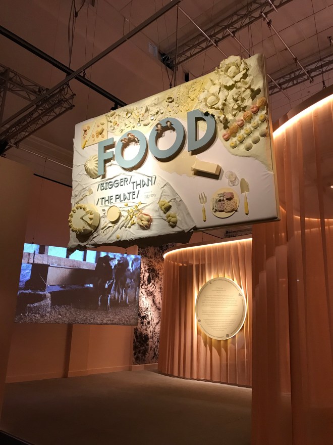
IMG_3814
Entrance of the exhibition

Food – it relates to everyone, yet the largest global issues that need solving today – from the changing climate to the right of workers and public health services – can all be traced back to what we eat and how we eat. In this situation the currently existing food system which mostly took shape in the industrial revolution needs to be reconsidered. As the distance between the source of our food and our plates grow we all feel disconnected from what we eat. Often we don’t know where it comes from and how it was made.

The exhibition at the V&A ‘FOOD: Bigger than the plate’ shows the reality of our food production, explores questions and possibilities for a better food future. They displayed designers’ and artists’ works through four areas, starting with composting, then farming, trading and eating.


The exhibition had a very strong start, exploring our relationship with waste, what is disposable and what could be reused. An unexpected aspect of this was human waste. In past centuries it has returned to the earth, but now it’s getting flushed down the toilet along with some drinking water to a landfill or the ocean. This is ruining the nutrient cycle.

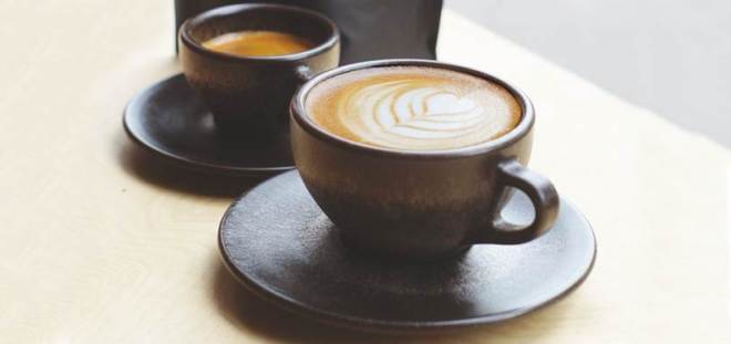
One of my favorite items displayed was the Kaffeeform cup, designed by Julian Lecher. These coffee cups are made out of used coffee grounds, gathered from cafes around Berlin, closing the ‘loop of the cycle.’ I really loved the idea that we can make waste presented in a beautiful and practical way in day to day life instead of just throwing it away.


kaffeform
Jennifer Ferreira​(​2018) Kaffeeform coffee cups b​y Julian Lecher

With the industrial revolution, farming methods and people’s diet has changed. Most people are detached from how food gets to the supermarkets, how animals and other species are involved and how we depend on them to survive.

To boost our food production humans always tried to redesign plants and animals to suit their needs with techniques like selective breeding which was essentially a pioneering method similar to modern genetic engineering. However now meat is mass produced and has become cheap and a central part of this new industrialized system.

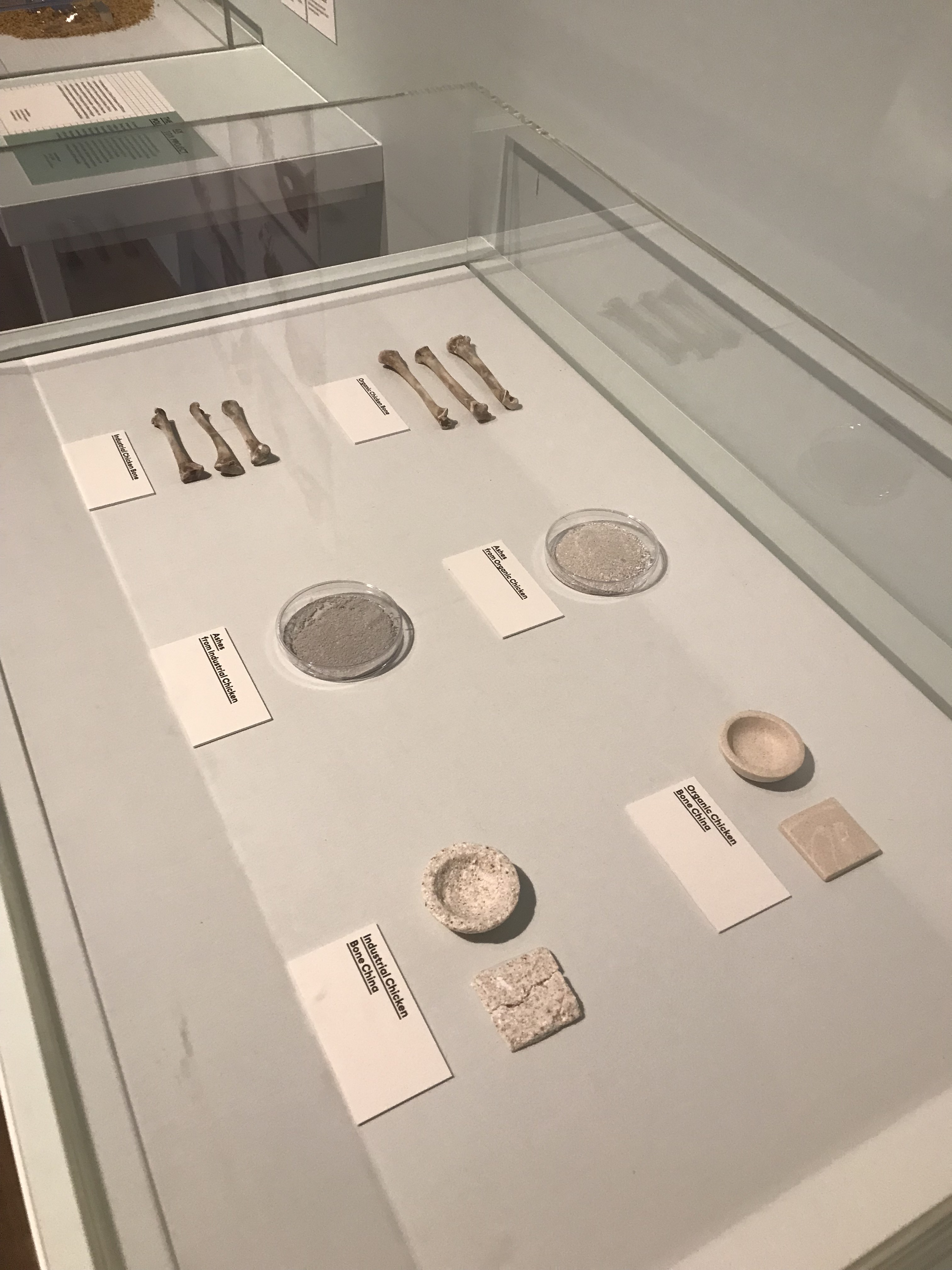
After I watched a 13 minute clip from the documentary ‘Our daily bread’ that presented our European high-tech food production. I entered the next room where they displayed ​​Nienke Hoogvliet’s work. She worked with scientists to make porcelain from the bones of factory farmed chickens and organically raised chicken, the difference between the two was obvious.

IMG_4085.JPG
Bare Bones by Nienke Hoogvliet

The food we consumed used to be from local farms, livestock and plants and we ate different food in different seasons. Industrial production may have lowered the price of food in our supermarkets’ shelves but the true cost of this has only been shifted behind our back. The way in which we relate to what we eat is more visual, focusing on brands and not on the act of eating itself.

The last part of the exhibition, eating, presented bold new ideas around cooking and eating, it experimented with rules and traditions to prepare us for what we might have on our plates in the future.

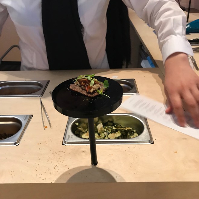
At the end of the exhibition we were asked by LOCI Food Lab if we could design a better food culture, what would our top priorities be? We were given 16 choices (such as from zero waste, biodiversity, affordability to transparency, etc.) and were allowed to choose three. Then based on our choices we were given a chance to taste our own food and were served a personalized snack, drawn from a selection of ingredients from the english lowlands beech forest bioregion (in which the V&A is located).

IMG_4381
LOCI Food Lab

It was a great finish to this exhibition. Although at some point during the exhibition I felt that there is no way back, we messed it up too much, I left with a feeling of hope and motivation. Better food future is different for everyone. Our priorities are different. What is sure that over the last 150 years our society has made lots of mistakes and we have to start having a new discussion when we look to the future.

For the few big corporations controlling the food industry the most important thing is profit. In pursuit of this they are willing to neglect nutrition, taste, fairness and diversity. But thankfully the number of people who don’t agree with this is growing and they are constantly challenging our reality. They try to make the process of how food is delivered to our plate more visible, while also trying to make trade and distribution better. The value of food is being refocused from profit to benefiting everybody from those who produce it to the people who eat it and ultimately: the planet.

Surveillance

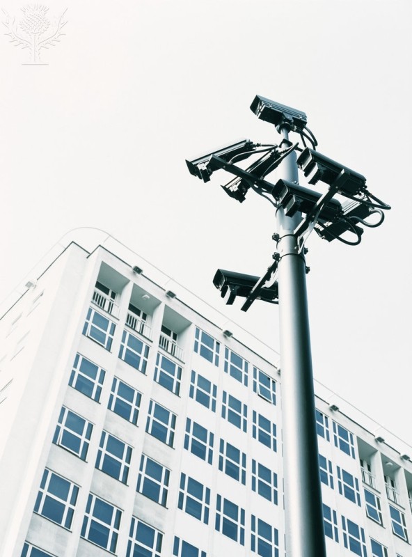
132_1309362
Surveillance cameras. Closed-circuit television (CCTV) cameras mounted on a pole. Photographed in Holborn, Central London, UK.

In this lecture we talked about visibility and visuality, what can be seen and how it is seen. We also talked about who is represented in our visual culture, who is seen, how they’re seen and who is excluded?

Photography was always used to document things. Lewis Hine, an American photographer proved that child labour exists when everyone denied it by taking pictures of the children who worked in factories. This is an early example of the well known thought: if you can see it, it’s real. It is more and more important for our visually hungry culture to register our existence. To prove our existence. To prove our importance.

Since technology is getting more accessible people are starting to use the camera and various softwares more and more. The more they do this the deeper the gap gets between the physical and the virtual self. The fact of being seen changes human behaviour, everybody acts differently in front of a camera, be it more extravagant or more shy.

When someone can control these tools, control the camera then they use it in any way they want: take shots from the best angles, showing only the most beautiful side of something. The person who has the camera, has power.

Panopticism

The idea of the panopticon was originally proposed by Jeremy Bentham in the 18th century. It was a circular building that had a tower in the middle. Around the tower there was open space and an outer wall. The goal of this structure and the design was to provide the most amount of security and surveillance. This is an architectural structure without guards or doors. You don’t need someone in the tower as long as people think there is someone there.

This is basically true in our modern society. Our public space is a panopticon, there is the obvious example of the countless CCTV around London, or the speed cameras monitoring our streets continuously. Apart from these examples there are the more subtle ones: we are happily sharing what we are doing, where we are doing it with large corporations. We record when and where we go for a run, we share and tag it on Instagram when we leave our home empty for the holidays.

Photographs:

CORDELIA MOLLOY/SCIENCE PHOTO LIBRARY / Universal Images Group

Shadows of the industry

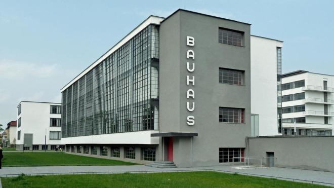
Bauhaus_Bauhaus School Dessau_cr toml1959 Flickr CC BY-NC 2.0_ed
Bauhaus Dessau – Exterior

Without a doubt Bauhaus was more than just a school. As we looked at the history and the manifesto of Bauhaus and what effects the industrial revolution had on design there were many questions we discussed: what should an art school look like? Who is a designer? What should design focus on?

I think there are lots of interesting questions that have been raised in relation to Bauhaus but there is one in particular that I would like to focus on. We talked about the relationship between designers and the industry: ‘If designers continue as enablers of the industry, they will be synonymous with ‘stylists.’’ How much are we letting the industry to shape the designers and not doing it the other way around: the designers shaping the industy?

Most of us would agree that the graphic design industry is very much dominated by products from Apple and Adobe. What would happen with the designers of today if we would take these tools away from them? Would they be still designers without these? Computers changed the way how we live just as much as industrial revolution changed the world in the 1900s. It is very obvious that there is no way back.

What bauhaus was doing is that they did not let the industry shape them. If Herbert Bayer would apply to a job in 2019 stating that he can’t use these softwares would he even receive a job in the industry? Does Apple or Adobe enable the designers to create anything they want or does it restrict them?

Are these tools in the way of our creativity and our thoughts? Do they restrict and imprison us by unconsciously limiting the creative process? Are they becoming more than just tools? Also how inclusive is an industry where you need to pay a certain amount to be even able to participate? How many percent of the world population can actually afford that? Is money that makes us designers? Or Apple? Or a software? Are we stylist or a designers?

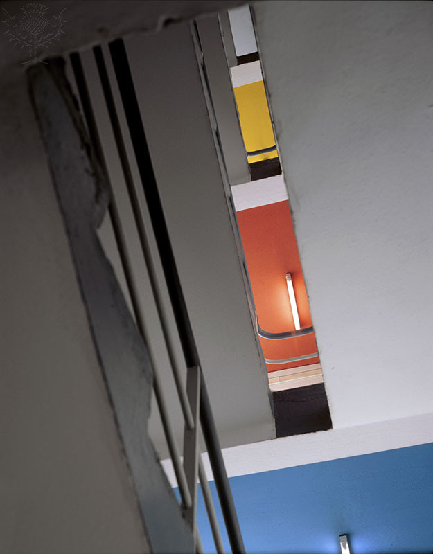
BAUHAUS DESSAU 1925-6, DESSAU, GERMANY, WALTER GROPIUS, VIEW UP STUDIO BLOCK STAIRS.
Bauhaus Dessau – View up studio block stairs

We can quickly see that this can become a very exclusive group if designers create designs using the computer to be viewed on a computer for people having access to all these tools and I wonder how meaningful this is if a good proportion of the world is left out?

Photographs:

Bauhaus Dessau Exterior (1990)  photo Erik Bohr

Bauhaus Dessau (1925-6,) view up studio block stairs.

Perspective

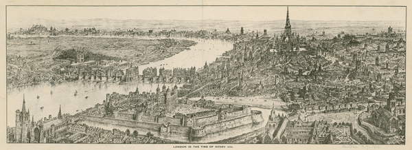
This lecture focused on cities, a place where people and design meet. We talked about the fact that it was always important for humans to know the landscape of where they live. This is easiest to achieve from a high point, but capturing some of the biggest cities like London as a whole was a real challenge.

610821
19th century view of London

From the late 1800s, when people started to develop airplanes and aircrafts there was a profound transformation how the general public perceived and imagined cities. Fast forward to our current generation and a ‘bird’s-eye’ view is completely taken for granted, it has fully integrated into our visual culture and defines our worldview. By using something like Google Earth, which is readily available for anyone, we can even have access to a very valuable political data that was not possible in the past.

It is interesting to see that drones, that anybody can purchase without a license, have a peculiar place in our contemporary culture: we all feel a bit concerned and worried about something that can float above us. The reason for this most likely dates back to the Second World War when bomber flights above the cities deepend our worries about anything that is above a city and can also represent power and control.

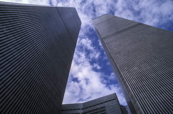
4066804
The twin towers of the world trade center

However cities not only expanded ‘horizontally’ but vertically as well which offers a new perspective. Starting off from these thoughts we talked about the movie High Wire in which a French high wire artist, Philippe Petit walked for 45 minutes, back and forth on a metal cable between the towers of the World Trade Center. We can look at this as a crazy and pointless act, but this public art in New York City represented rebellion, Petit refused to obey the rules and gave us a new perspective. Afterwards in an interview he said that life should be lived on the edge, and interesting thought opposing our desire to live a comfortable life.

Photographs:

View of London in the time of king Henry VIII (19th century) Bridgeman Images

The twin towers of the world trade center, (1989) Marcello Mencarini / Bridgeman Images